
CONCEPT :
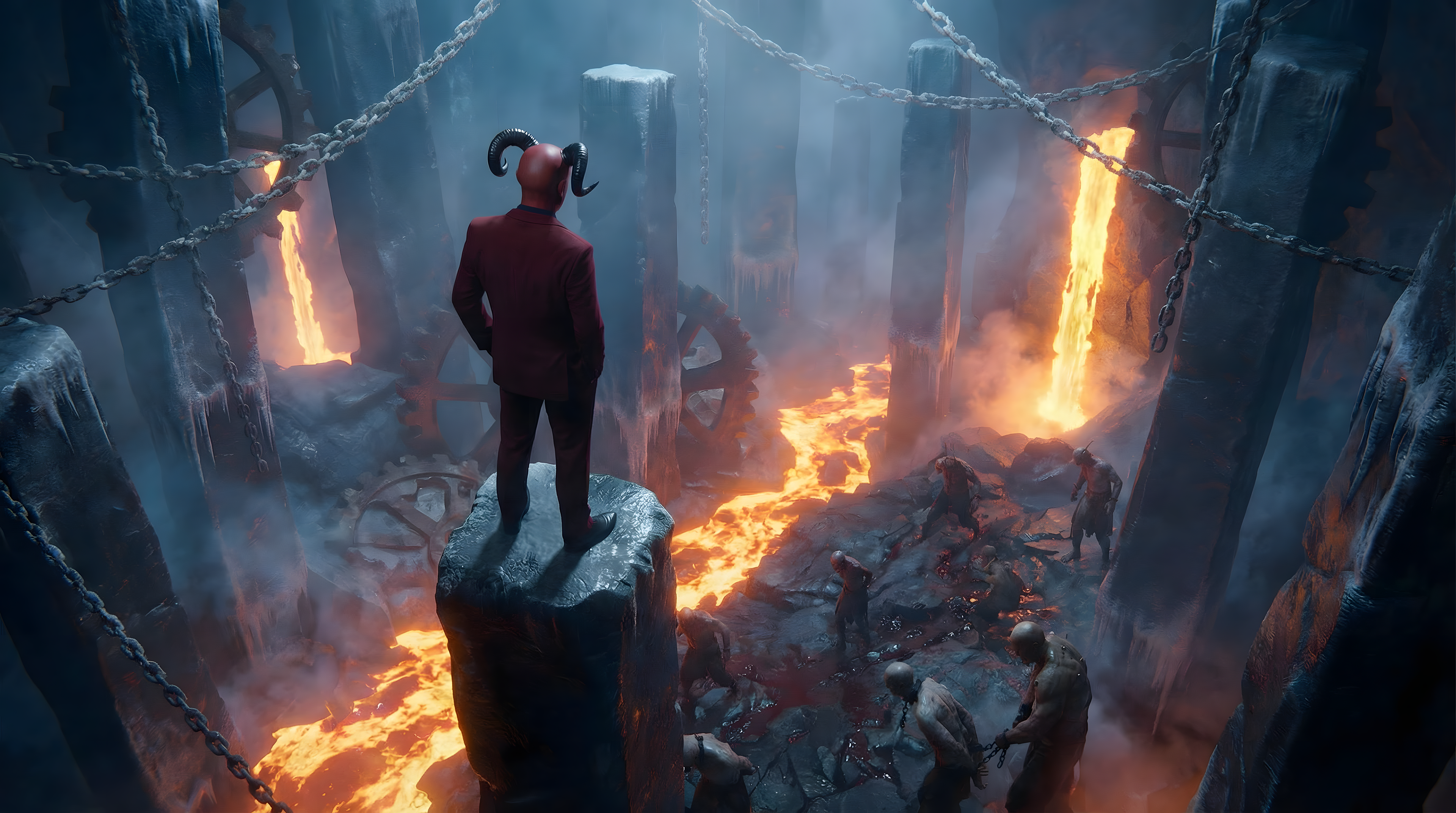
The idea was to take a familiar setting Hell and strip it of its usual intensity.
Instead of chaos, we introduce boredom.
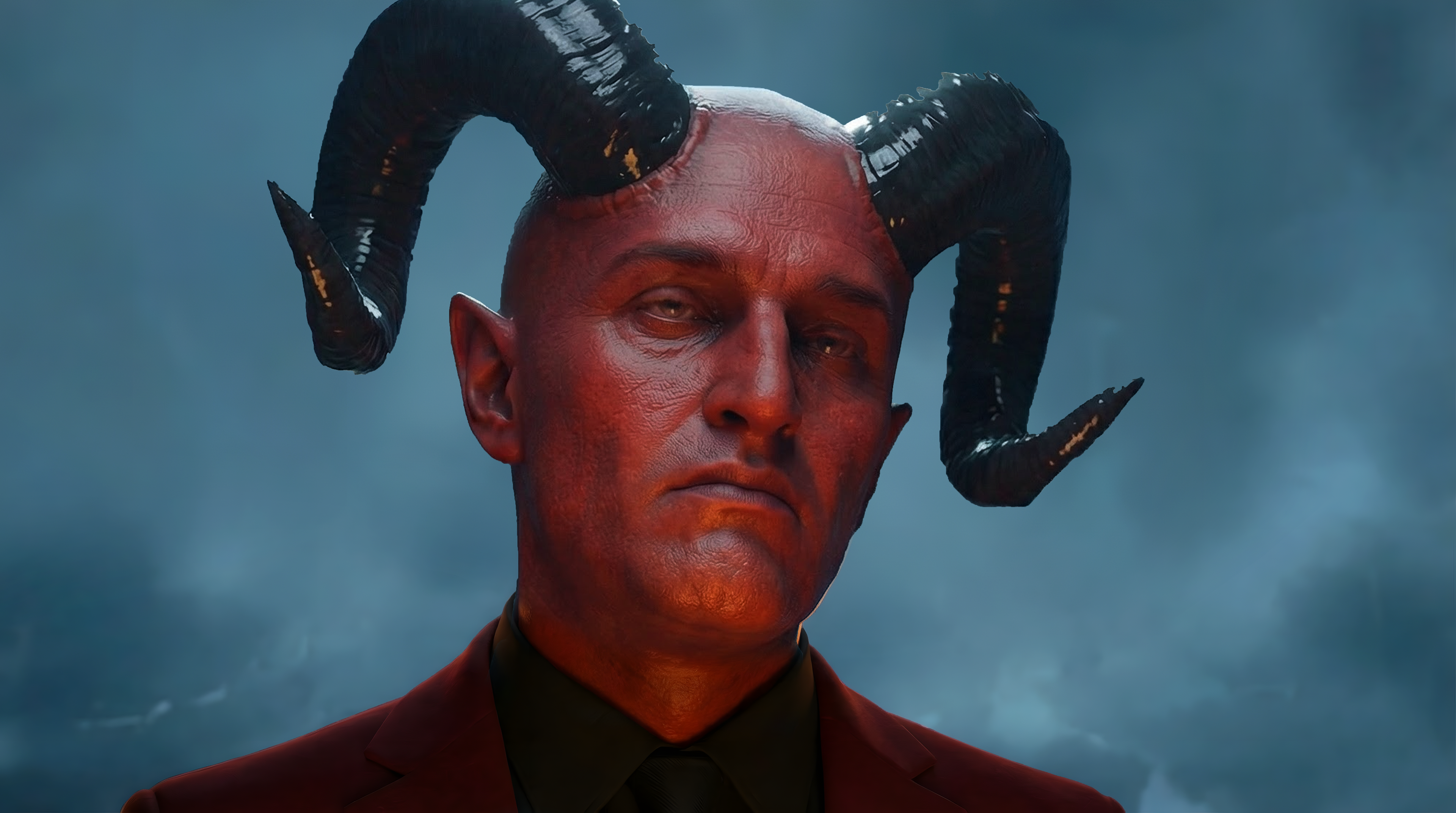
The Devil is no longer a symbol of destruction, but a character in search of stimulation.
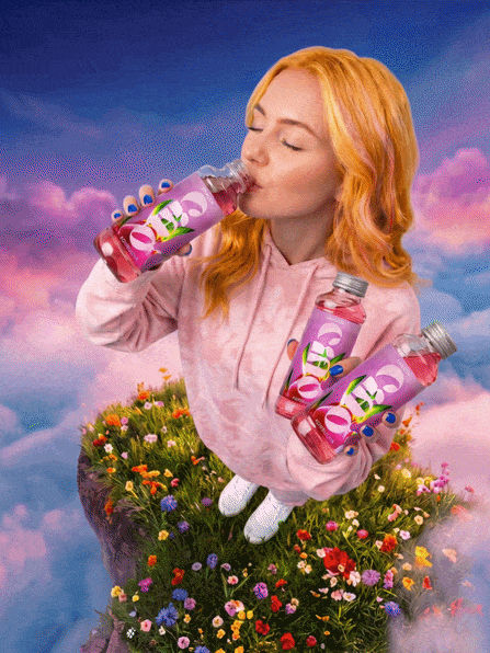
The product becomes the turning point.
A source of rediscovered pleasure.
A source of rediscovered pleasure.
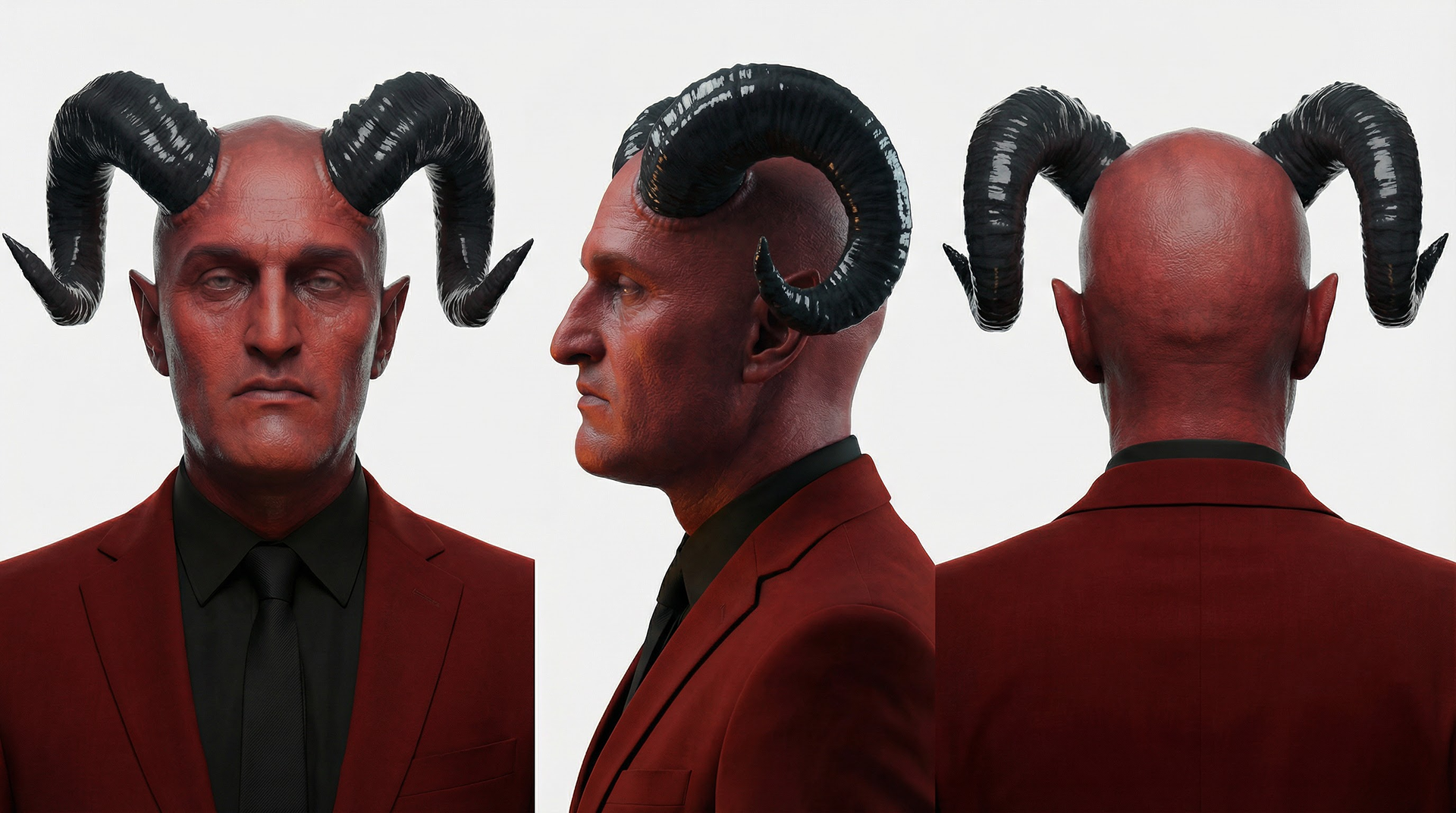
Character research :
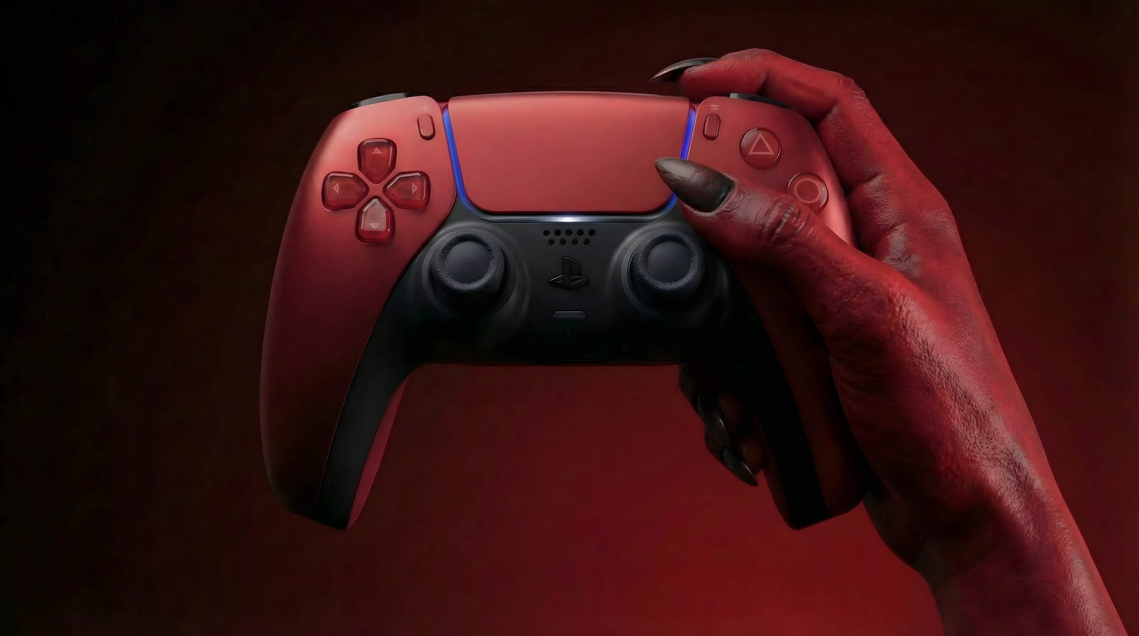
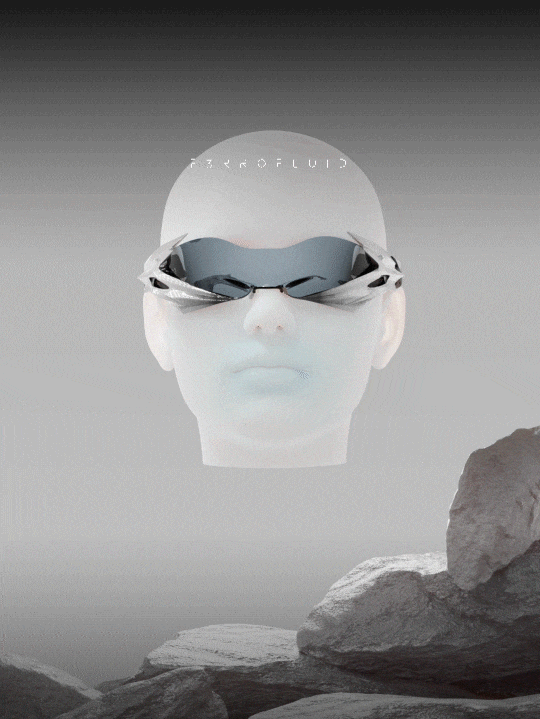
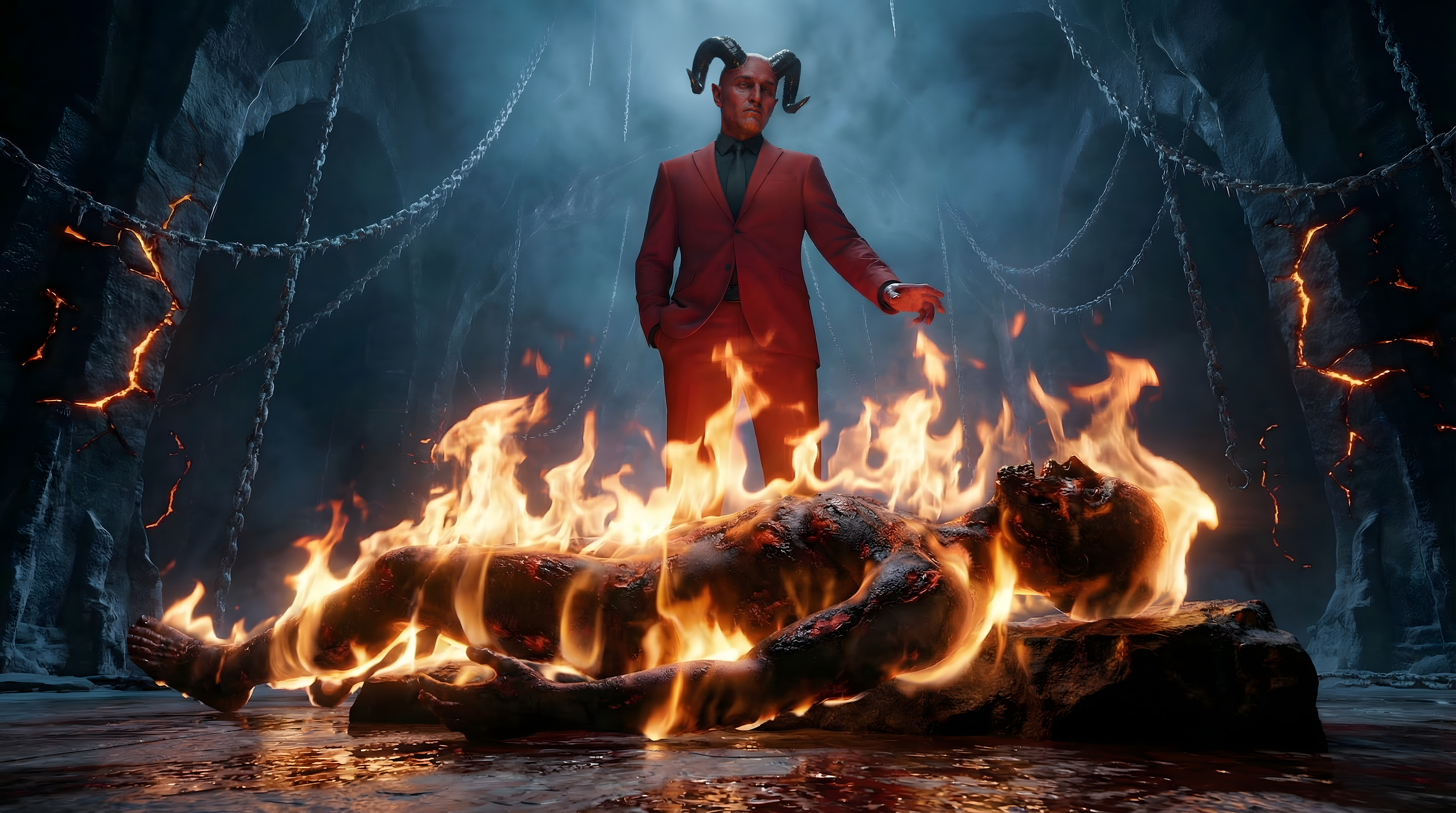
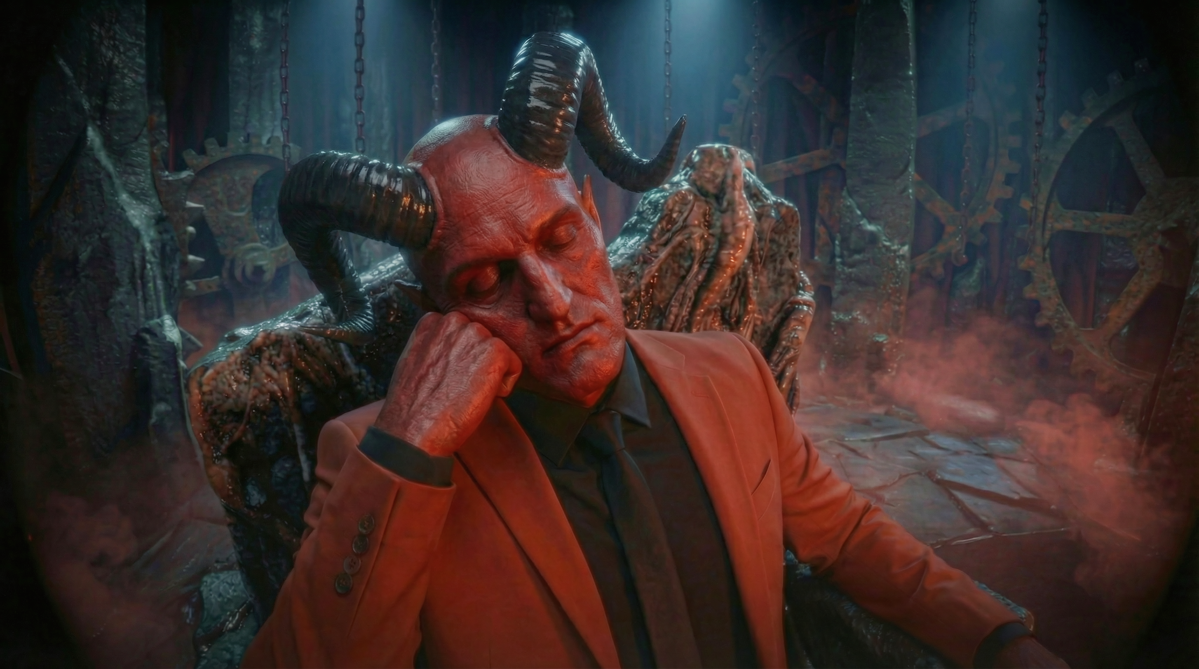
The Devil was designed as a modern and controlled figure rather than a chaotic entity.
Instead of a traditional monstrous representation, the character is portrayed as:
• Elegant
• Composed
• Almost corporate
• Composed
• Almost corporate
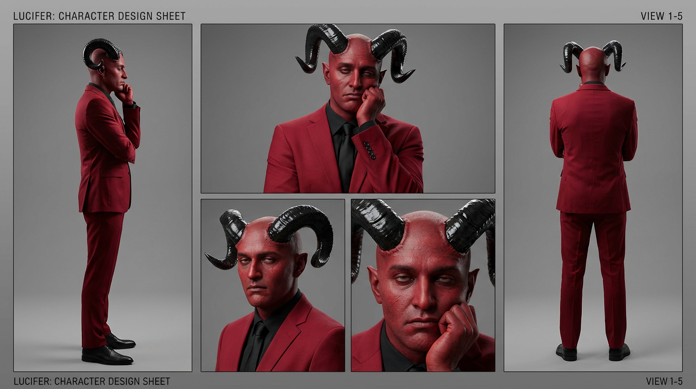
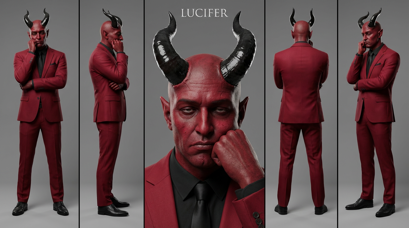
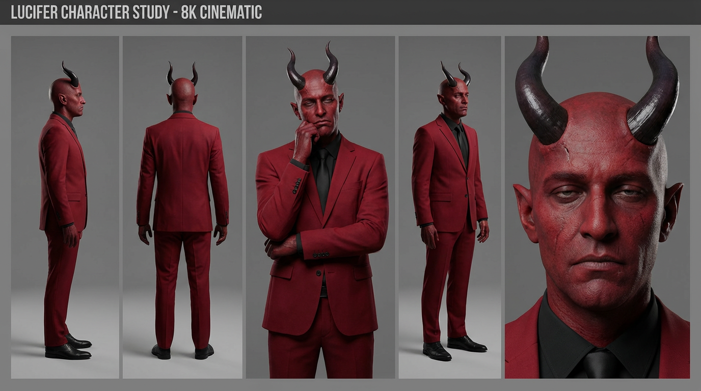
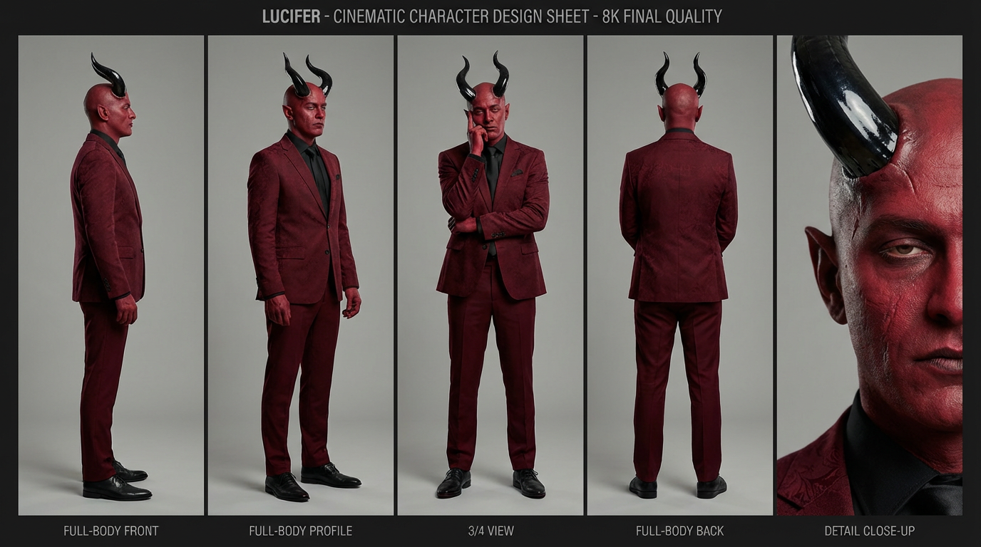
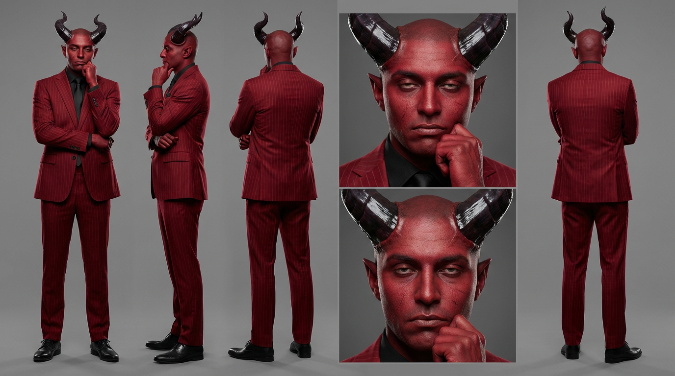

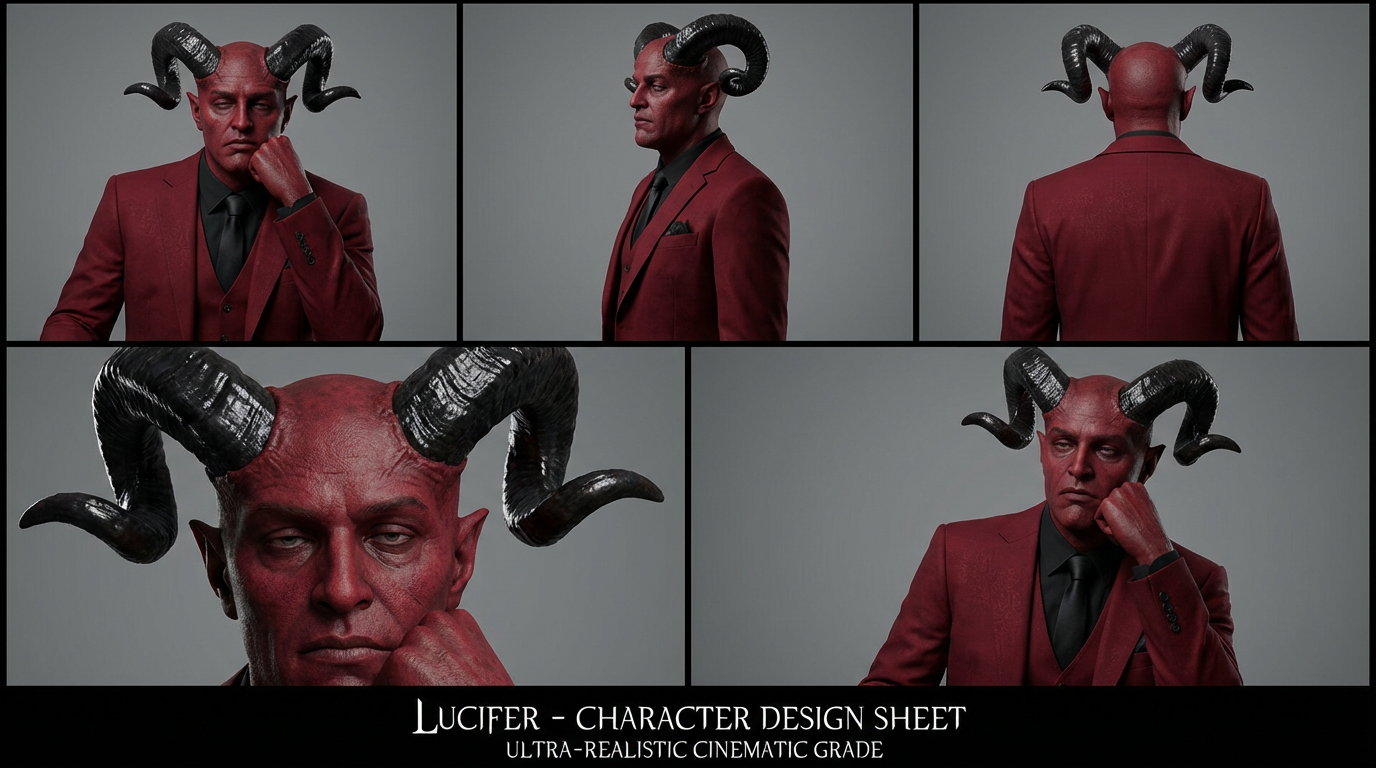
Final character choice
The final design embraces simplicity, allowing performance and lighting to carry the intensity.
AI workflow:
This project was developed using a structured production workflow designed to balance creative control and execution speed.
This project was developed using a structured production workflow designed to balance creative control and execution speed.
A combination of advanced tools and custom pipelines was used to:
• Rapidly explore visual directions
• Maintain strong consistency across shots
• Iterate on lighting, composition and materials
• Translate ideas into production-ready visuals efficiently
• Maintain strong consistency across shots
• Iterate on lighting, composition and materials
• Translate ideas into production-ready visuals efficiently
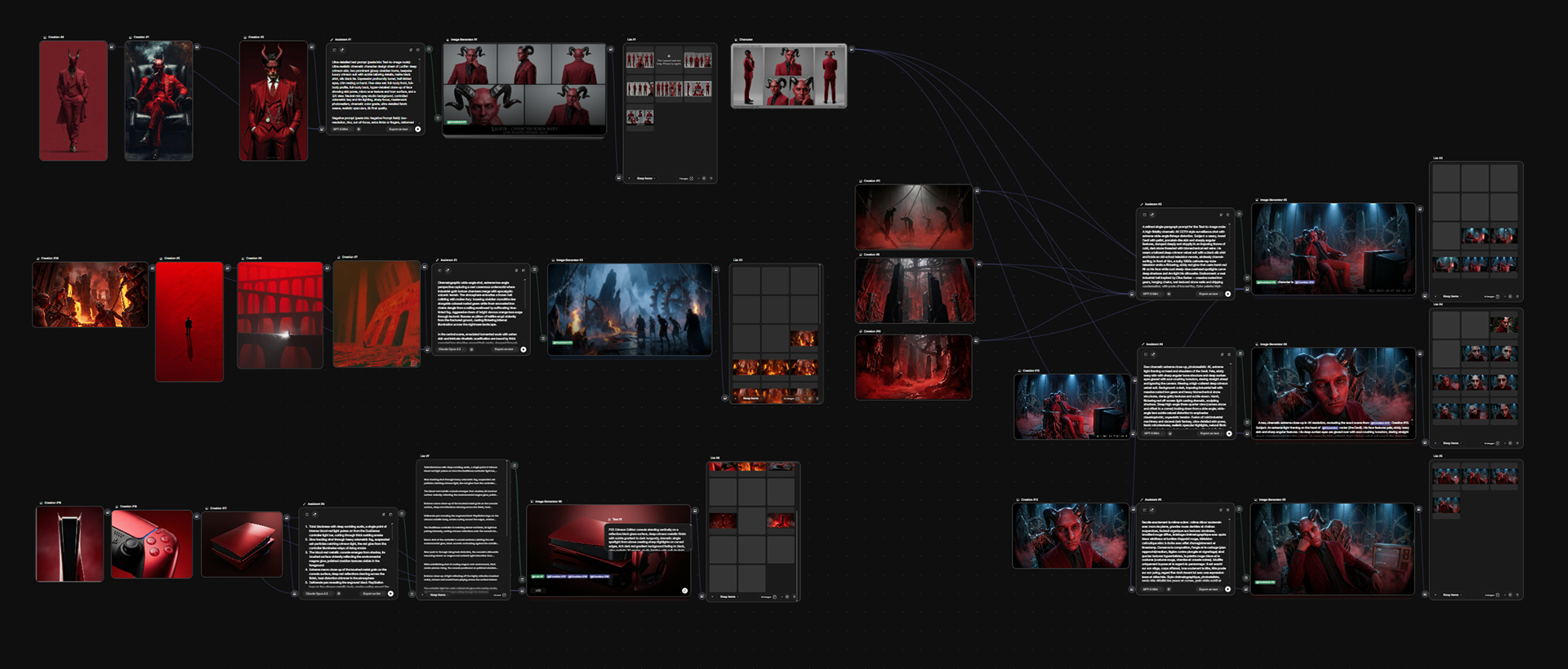
Rather than relying on isolated outputs, the process was built as a coherent system, allowing each scene to evolve while staying aligned with the overall artistic direction.
This approach made it possible to move from concept to final film with a high level of precision, while significantly reducing production time.
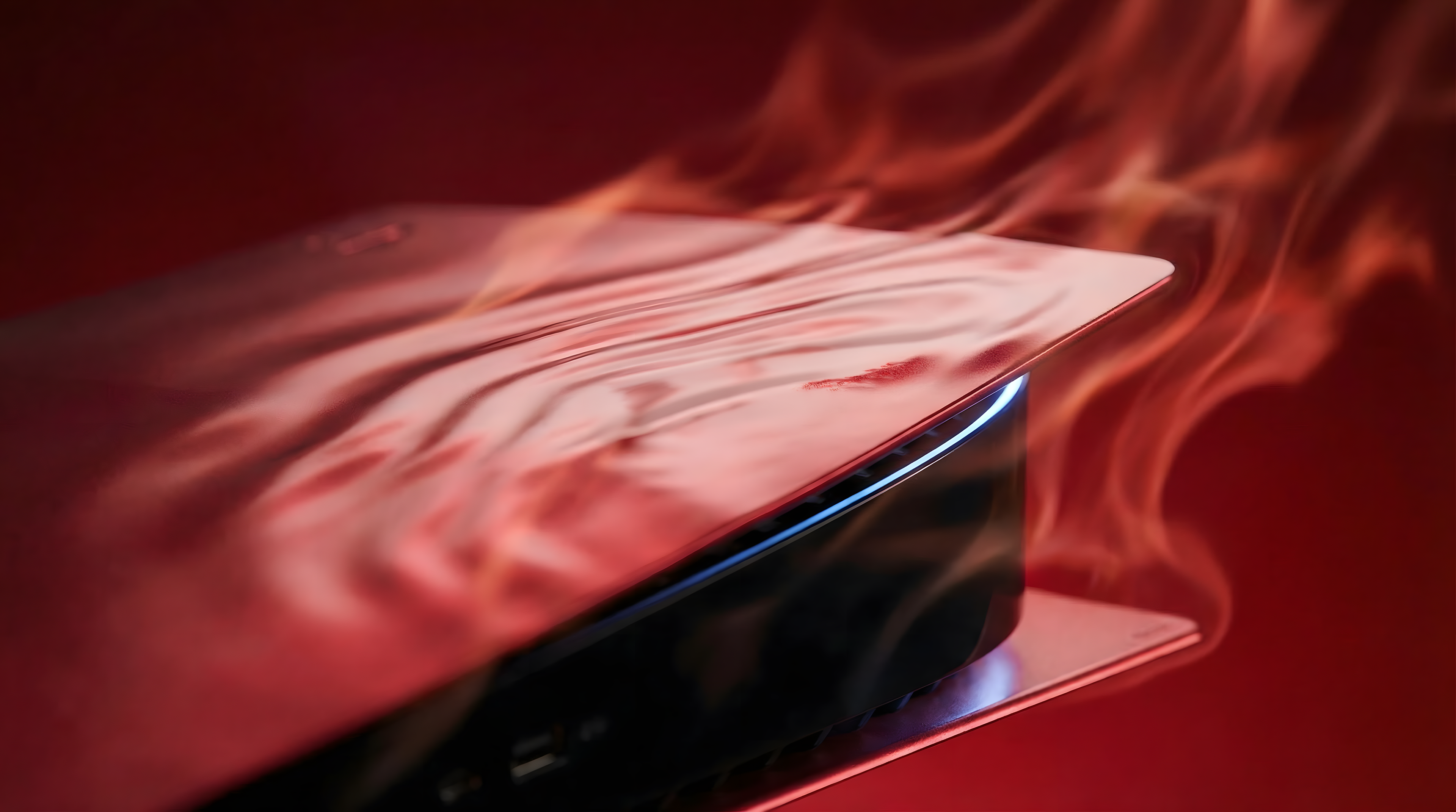
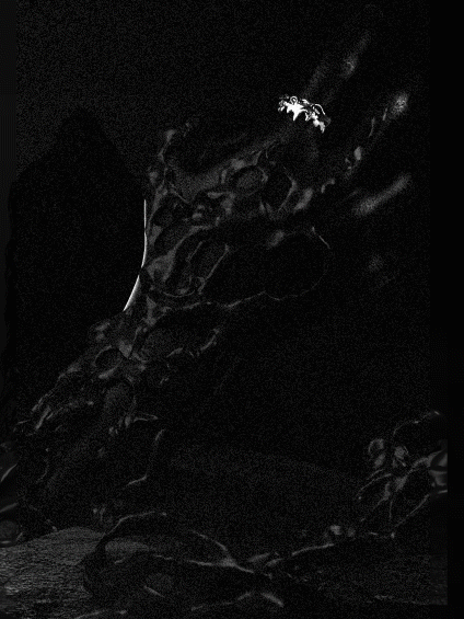
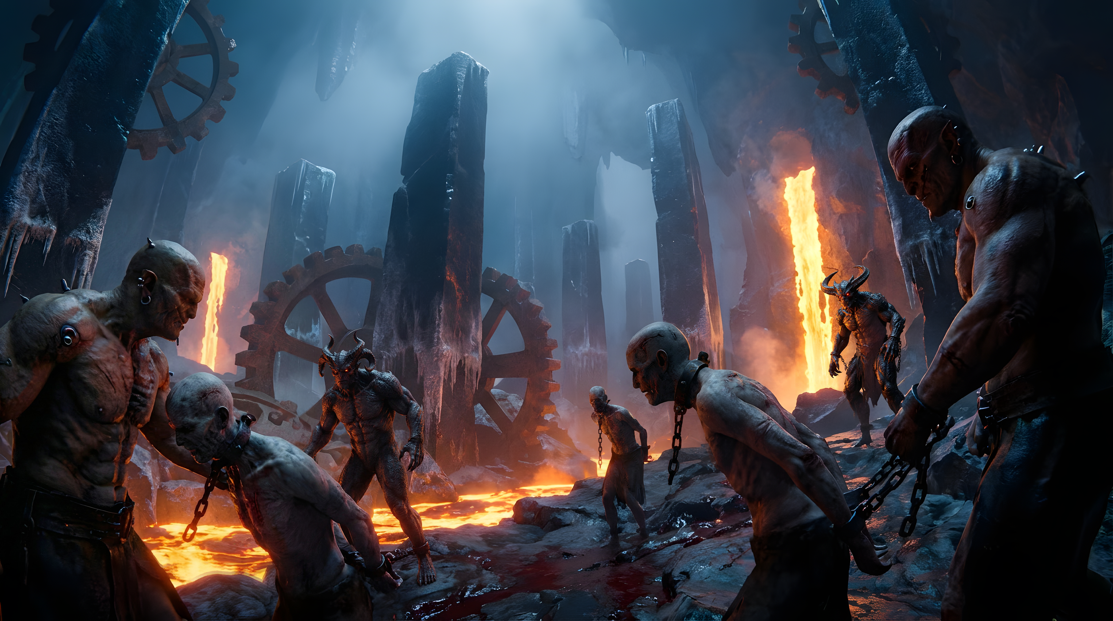
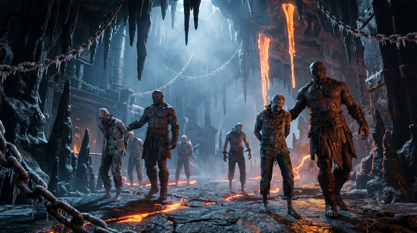
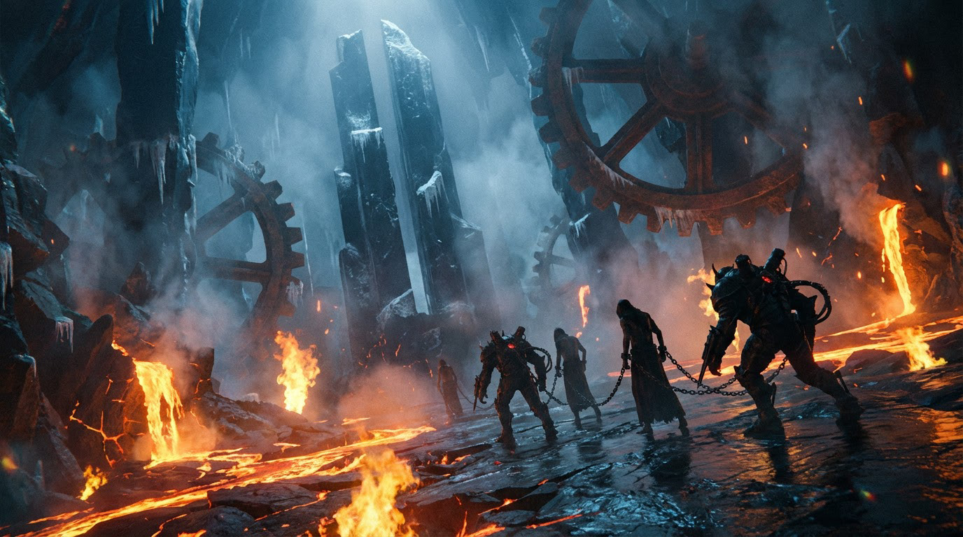
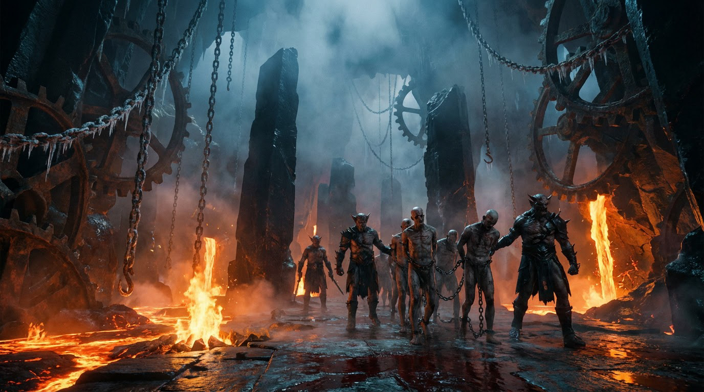
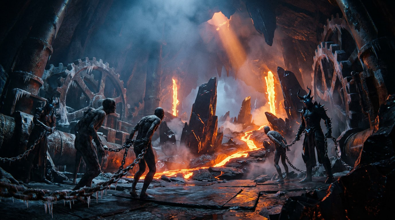
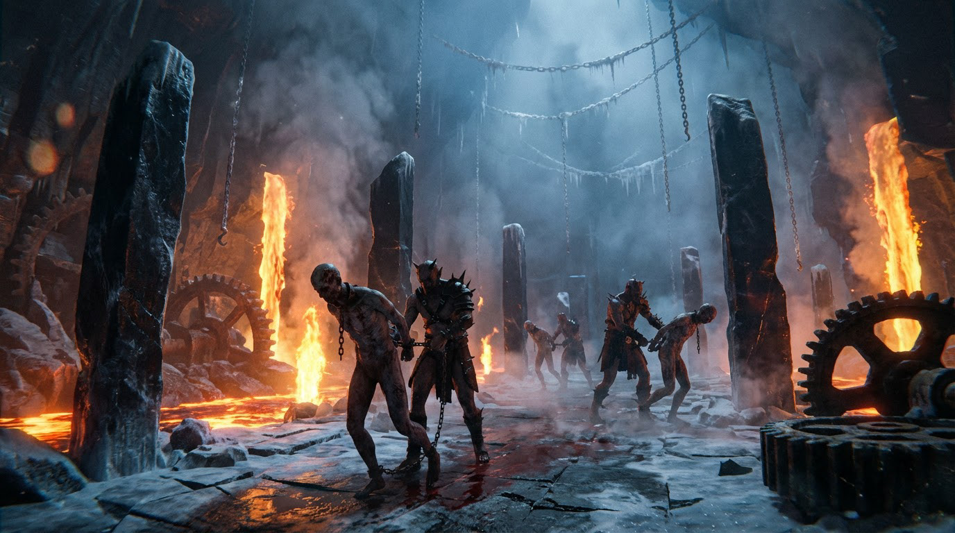
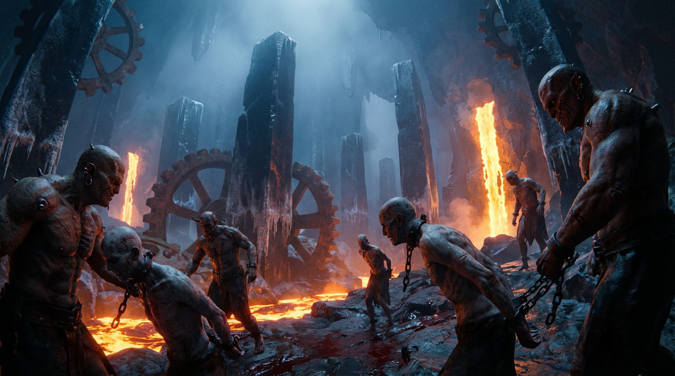
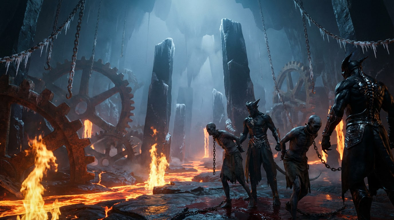
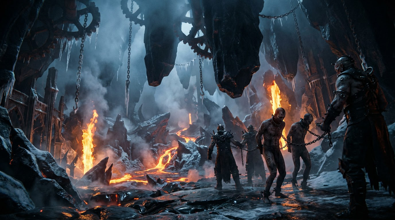
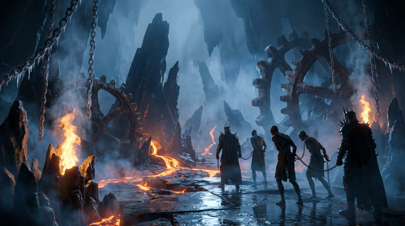
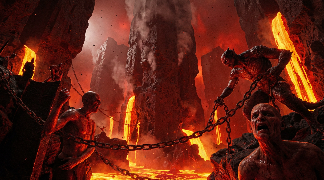
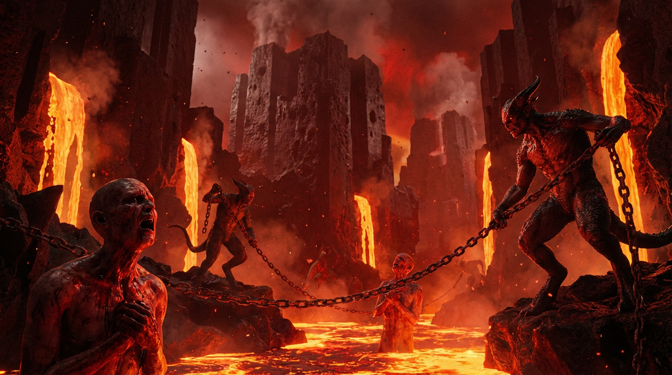
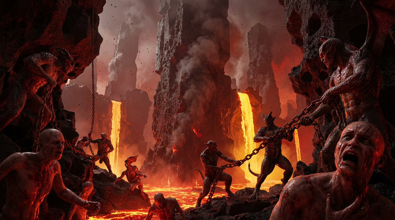
Environement research:
he goal was to move away from the traditional depiction of Hell.
Instead of a chaotic and overloaded environment, the direction focused on a colder and more controlled interpretation.
A space that feels almost still, restrained, and slightly unsettling.
A space that feels almost still, restrained, and slightly unsettling.
To create visual tension, subtle elements of lava were introduced as sharp accents within the environment.
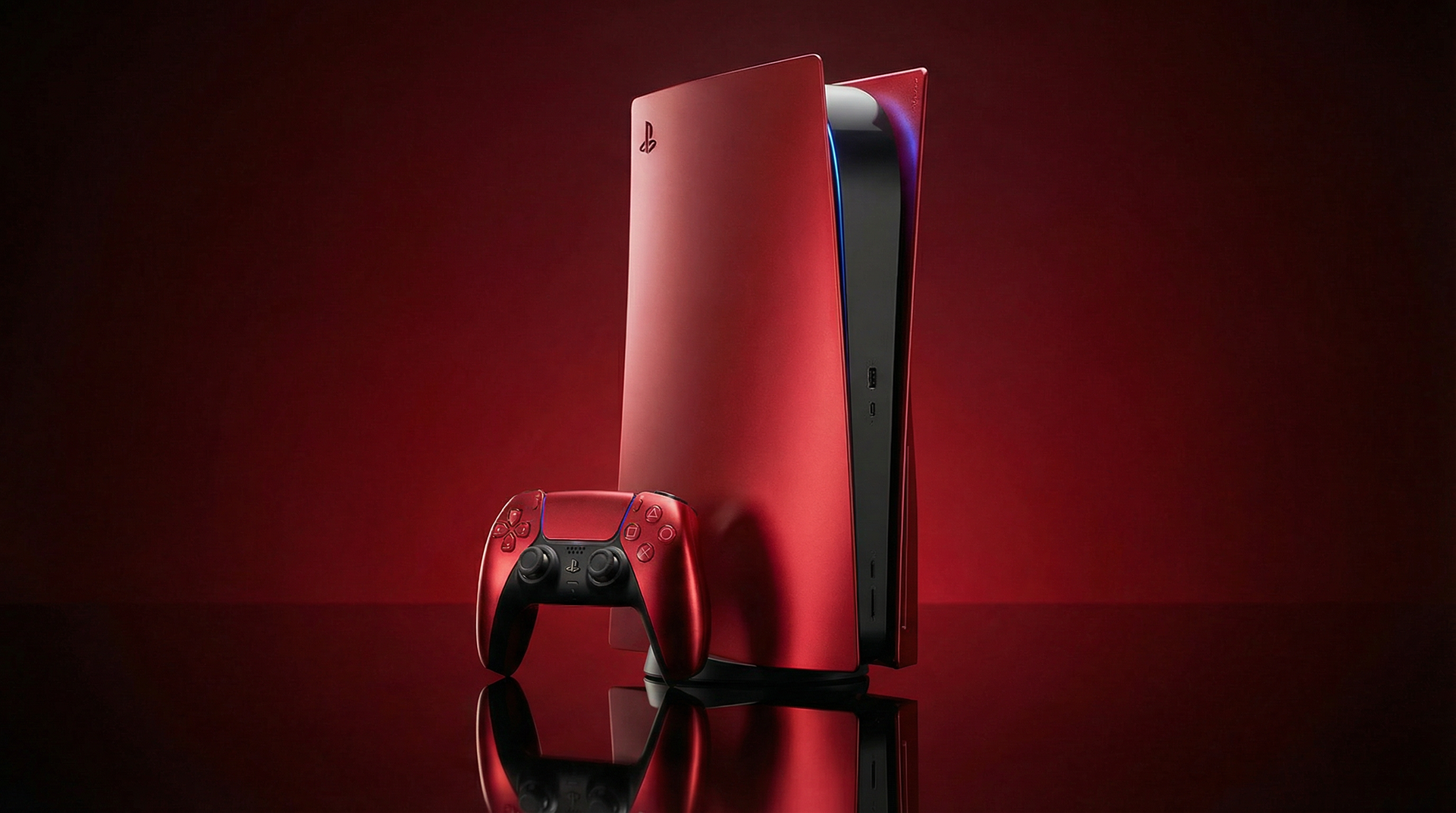
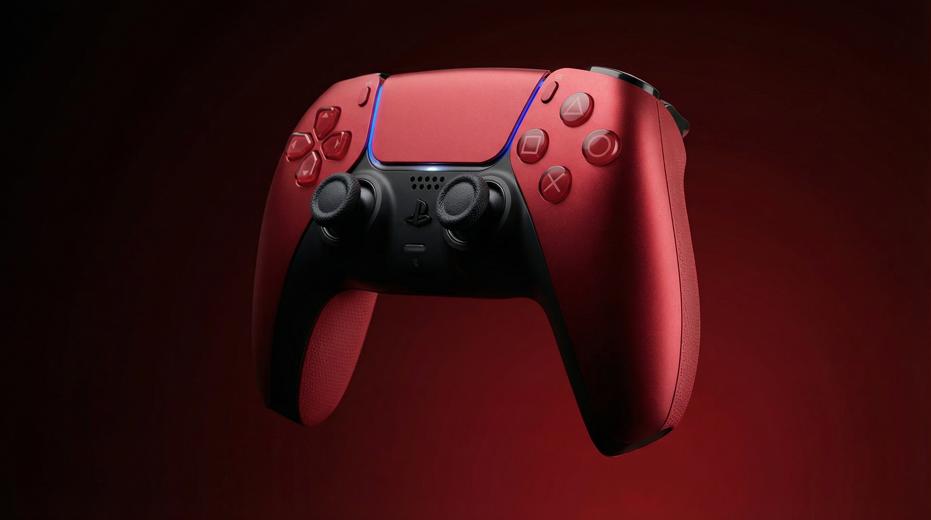
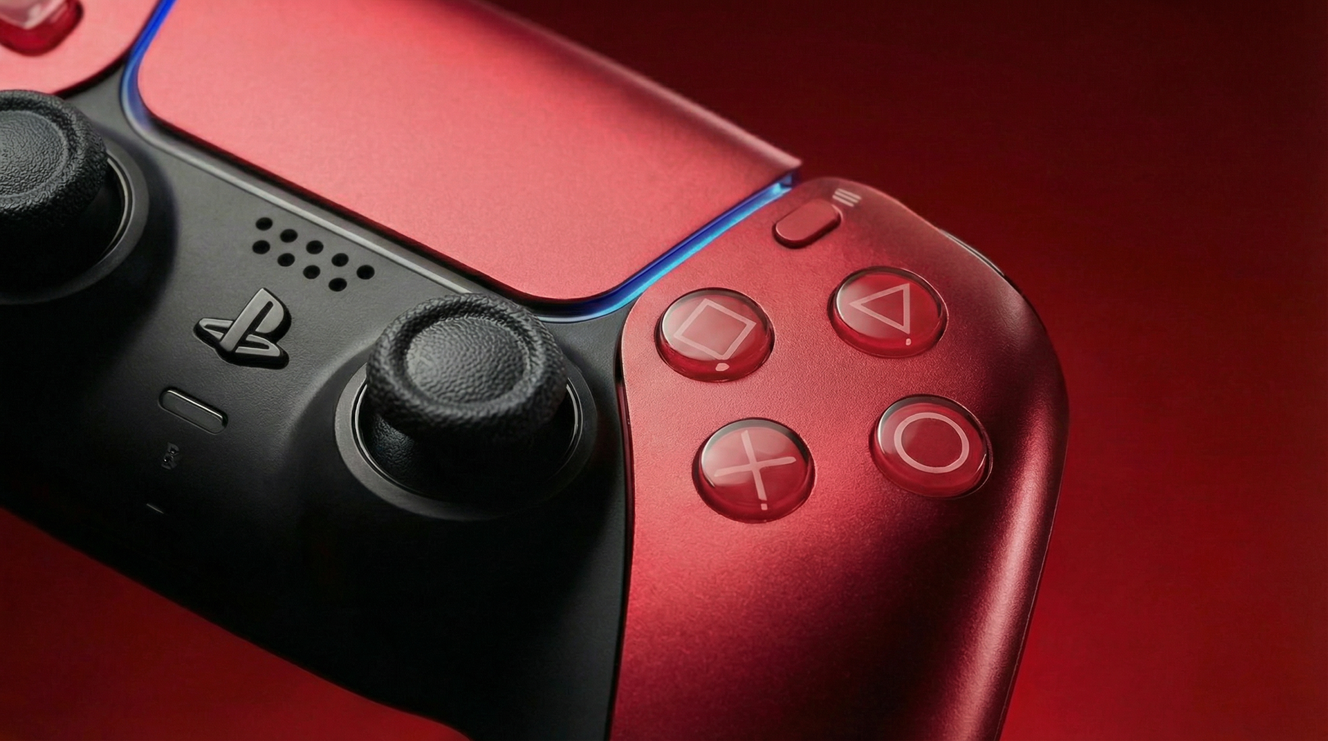
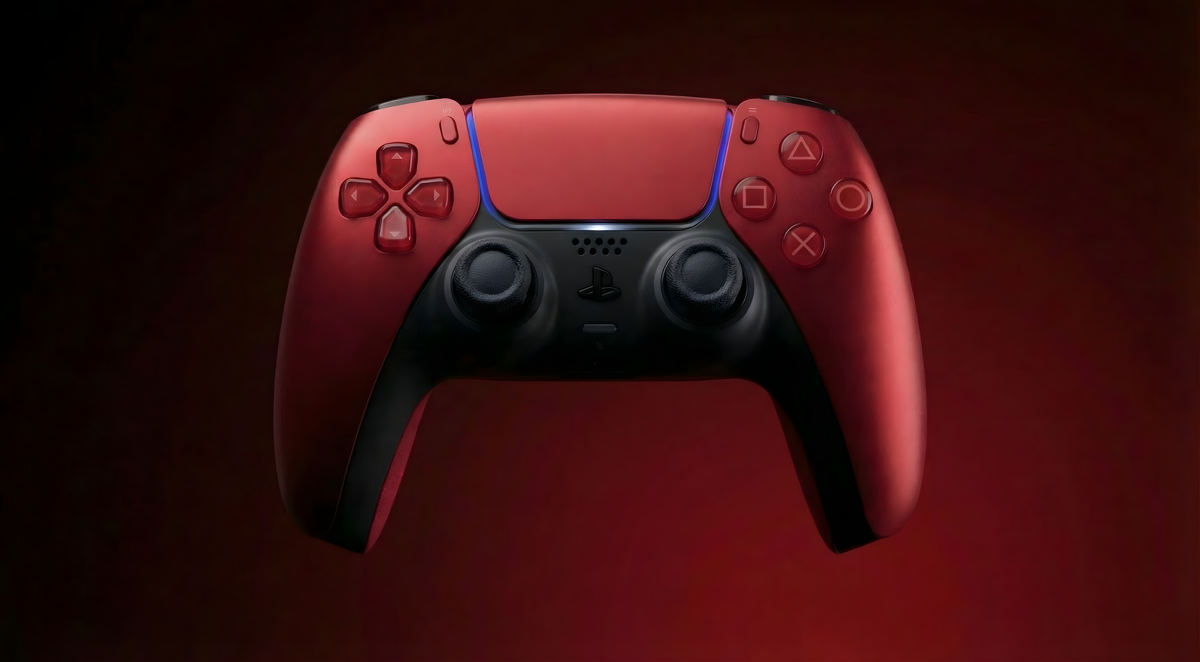
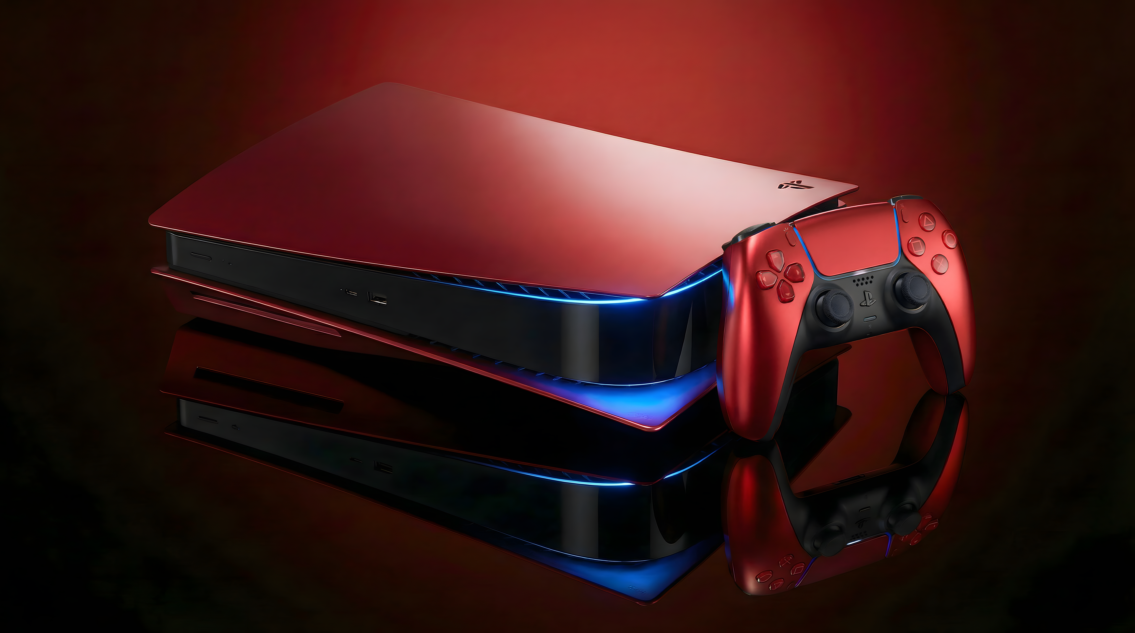
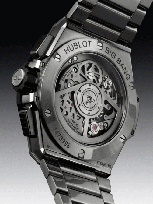
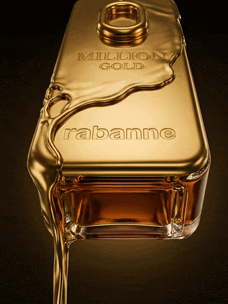
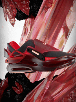
Product & art direction
The product is treated as a hero object, with a strong focus on clarity, lighting and composition.
The direction remains clean, minimal and controlled, avoiding unnecessary visual noise.
Sharp lighting, deep contrasts and refined framing give the console a premium and almost collectible presence.
This approach reinforces the balance between power, beauty and control.